Sign design options revealed for Seven Corners and Bailey’s Crossroads
Design consultants hired by Fairfax County’s Community Revitalization Section presented several gateway signage concepts for Seven Corners and Bailey’s Crossroads at a meeting on July 30.
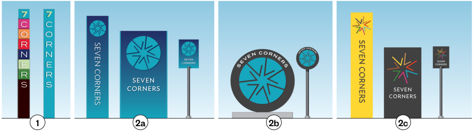
Ashton Design came up with several options for Seven Corners incorporating a symbol consisting of a star formed by seven number 7s.
The symbol represents the convergence of many roads, while a star is an American symbol referring to Seven Corners as a microcosm of American history, said designer Brian Ahola. It also reflects the idea of energy and motion.
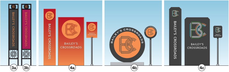
For Bailey’s Crossroads, Ashton presented two logos, both of which incorporate the interwined letters B and C. The theme for Bailey’s Crossroads is “the intersection of many things coming together,” Ahola said.
In selecting colors for the signs, Ashton turned to the colors on the Virginia flag and the Mason District website.
While Seven Corners and Bailey’s Crossroads would have distinct signage, the signs for both communities would have unifying elements.
Ashton considered public opinion from a community meeting on June 26 and the results of a survey in developing the designs. Another survey will provide additional input for refining the initial concepts. Take the survey here.
Related story: Residents offer input on gateway signage
Jenny Hoffman, the creative director at Ashton, offered a key takeaway from the June meeting: People preferred colorful signs that reflect the communities’ diversity.
Mason Supervisor Andres Jimenez said the goal of the gateway project “is not just about putting up new signs; it’s about creating a sense of place.”
The new signs “will reflect the community’s vision,” he said. “They will be something the community will be proud of.”
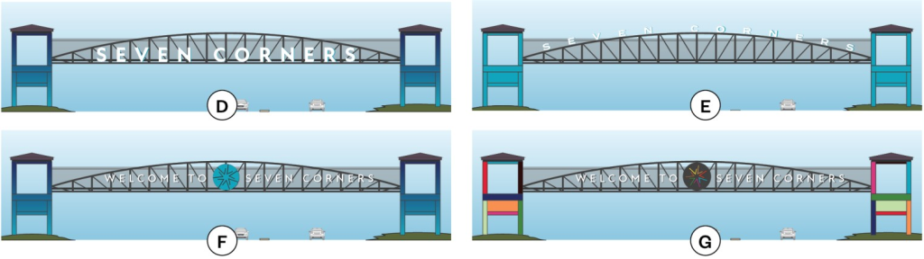
Gateway signs for Seven Corners are planned for Leesburg Pike, the pedestrian bridge over Arlington Boulevard, and the Seven Corners intersection.
Among the concepts for Seven Corners, option 1 is based on the original sign for the Seven Corners Shopping Center, with each letter on a separate layer. “The layering effect represents the idea that we’re lots of things coming together,” Hoffman said.
Concepts 2a, 2b, and 2c all use the star symbol but in different ways. Ashton also designed smaller, narrower versions of each design that could be used in smaller spaces.
Ashton presented four concepts for the pedestrian bridge in Seven Corners, including two with just letters and two incorporating the star symbol. Ashton also proposed painting the walkway on the bridge.
The locations for gateway signs in Bailey’s Crossroads would be on Leesburg Pike by the Culmore Shopping Center, Columbia Pike near Best Buy, and Columbia Pike near Carlin Springs Road. A larger, landmark-type sign is proposed for Leesburg Pike at the Skyline Center.
For the Bailey’s Crossroads signs, options 3a and 3b have two symbols: a decorative shape that symbolizes “crossroads” and a monogram of an intertwined “B” and “C” done in stripes reflecting the convergence of roads. 4a, 4b, and 4c just have the monogram.
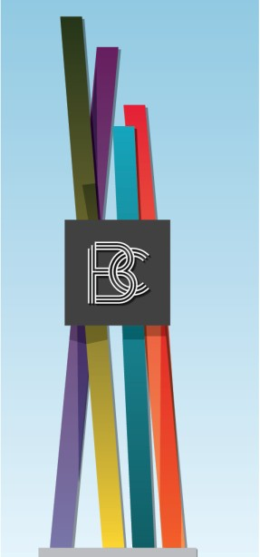
The larger “special moment sign” by Skyline would have four colored branches representing diversity and connecting in the middle with the monogram symbol.
Hoffman said the signs would be made of die-cut metal, most likely aluminum. They could be illuminated or incorporate reflective vinyl like street signs, so they would show up at night.
The design process is expected to be completed by the end of the year, said Liz Haag, head of the Community Revitalization Section. The next step is getting cost estimates from fabricators.
The two sites on Columbia Pike where the existing Bailey’s Crossroads signs are could be installed first. For the other locations, including the pedestrian bridge, the county needs to get permission from VDOT.
I’m partial to 2c for 7 corners. If they incorporate a circle then they really need to just make it a stargate – since it takes 7 chevrons to dial a gate address.
/nerd
/notashamed
2b, followed by 2a. I like the blue color, but a brighter one may be more recognizable.
Intertwined B and C letters is kind of dumb. The historical circus motif would be much better. 4b is the best.
Bold lettering a D and logo of F would be the most readable and bold.
I have to wonder how much money these people are getting for these “designs”?
The sign design does not reflect Baileys Crossroads history ( Barnum and Bailey ) Would much rather see a sign that incorporates the history of Baileys. I love abstract , but these signs do not reflect the history of Baileys at all . Adding in some way the small circus design that has been in past signs I believe would be more true to our city and history.
Adding to my original post about Baileys ,these designs look more like metro station signs – great if we had a metro but feel they just don’t fit as “regular ” city signs .
I don’t remember Andres Jimenez mentioning in his campaign that making signs and changing names to put on signs would be his #1 priority. Also, art. So, signs and art.
Like rearranging deck chairs on a sinking ship. More visual clutter targeting drivers is not-needed. Focus on improving pedestrian access (a sidewalk is a proven place improvement) landscaping, eliminating commercial storage of vehicles on public right-of-way, underground utilities, enforce and maintain public order, littering, panhandling in the public right-of-way are better signs of the times.
Will we have to raise the tax rates more? What is the estimated cost? Signage is expensive.
I am thunderstruck by the stupidity of these initiatives. We are now the parody. Leslie Knope could do better!!
2c and 4c
Cullmore should have DANGER signs.
7 corners should have
NO SHOPLIFTING and NO LOITERING signs.
Rt 7 and 50 should have
NO PANHANDLING signs. And USE THE CROSSWALKS signs.